Map Case: Brisbane's Flood Awareness Map
Mar 23, 2017 21:29 · 2174 words · 11 minutes read
The aim of the Map Case series of posts is to think through a map design and discern its purpose, the intended audience, the relationship between the geographic features, and suggest, if any, improvements that could be made. In the spotlight for this edition is Brisbane City Council’s interactive map called the Flood Awareness Map.
The flood awareness map as an illustration to the page.
More a page than a map, the Flood Awareness Map itself takes the form of an illustration to the surrounding text. It is a refreshing map design because most of the interactive maps I see published online try to mimic a desktop application rather than explain something through a series of paragraphs. In this case study I review the design and conclude with some suggestions on how conventions around page layouts could be taken alot further.
Purpose
The problem this map is trying to solve is clear and relatively easy to discern. It can be distilled down to three questions:
- Is my property of interest subject to flooding?
- What is the cause of that flooding at the property of interest?
- Has there been an actual flood at my property?
These questions are resolved on the map in differing ways. A ‘Map Legend’ sidebar is used to resolve two of these questions but a series of four radio buttons are used for the other.
Likelihood of flooding
The likelihood of flooding is presented to the reader in four categories defined by the annual chance of flooding. A percentage is used but the user is unable to set the percentage chance of rain in anyone year themselves. Rather, the user is restricted to four choices: high, medium, low, and very low.
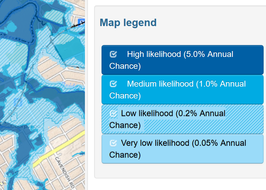
The four categories defining likelihood of flooding.
Cause of flooding
There are four causes of flooding along the Brisbane River: river, creek, storm tide, and overland flow. The user is able to select only one cause of flooding at a time. Two sources cannot be displayed similtaneously. This is what I mean by radio buttons.
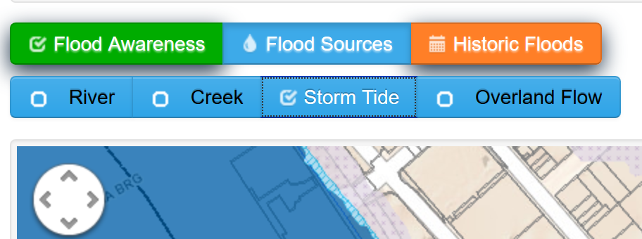
Radio buttons which appear once the four sources of flooding button is selected.
Past floods
Like the other factors affecting a property during a flood, the extent of past floods can be shown one flood event at a time, but no facility to overlay one upon the other is permitted. Only the 2011 and 1974 floods are available. The extent of each flood is show on the map using blurred lines because of the incompleteness of the data. A point I return to in the conclusion.
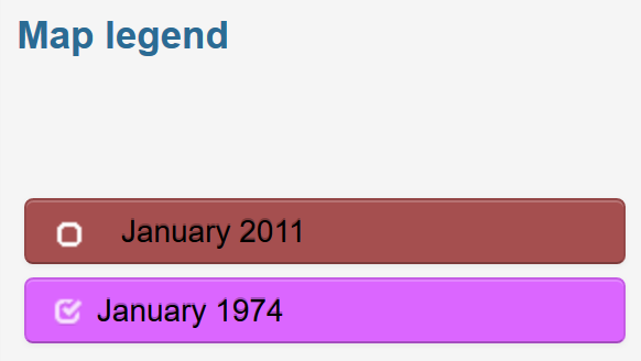
After selecting historical floods, these two past floods appear in the legend.
Audience
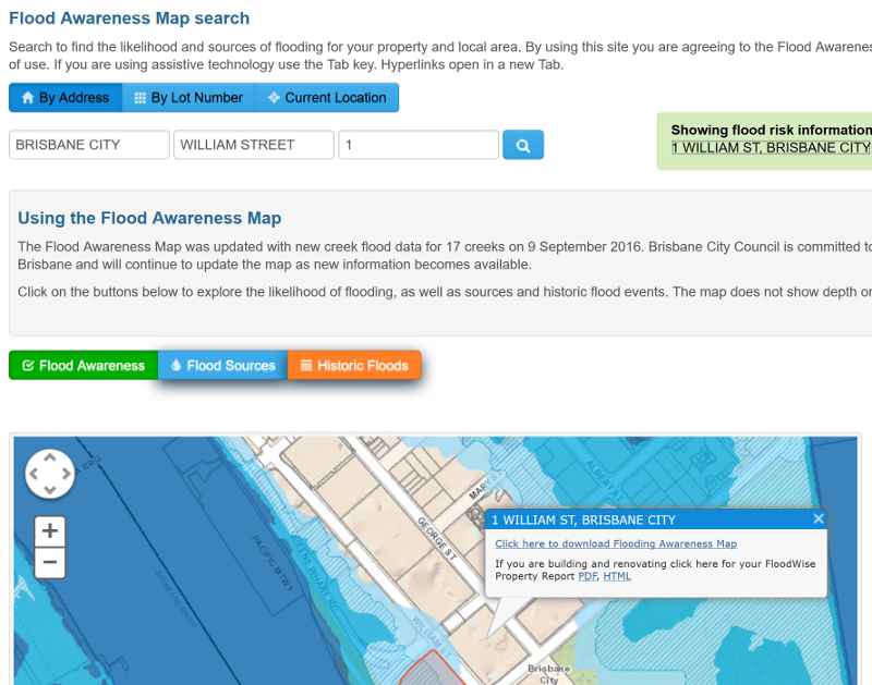
The Flood Awareness Map caters to residents and businesses of the Brisbane area. The key unit of analysis is the property lot. Those people interested in the relationship between property lots and flooding form the audience and include rate payers, prospective mortagees and investors. With that said, the map contains specialist information in a property report which can only be examined by clicking a link in a callout that appears on the map when a property lot has been searched for successfully.
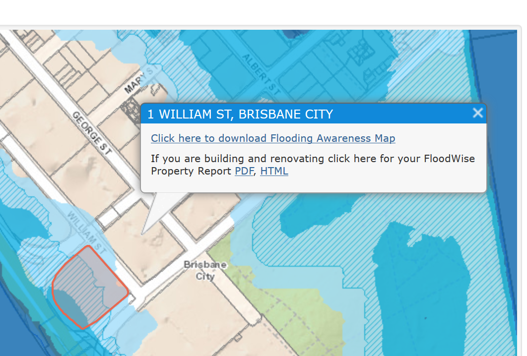
The callout revealing the link through to the property report.
If you follow this link a document appears with a warning message at the top of the page. It says, ‘this report is for building and development purposes only’. So the maps has another master. In this case, the report suggests a more specialised audience made up of architects, building developers, town planners and certifiers. Two personas then can be used to decribe a typical work flow.
The Resident
Conventions around page layout are used to get the resident started in the right place. First, in the top left of the page is the facility to search for a property of interest. Next, the resident chooses a flood topic that interests them (flood awareness, flood sources, or historic floods). Finally, the map is oriented to their property of interest and a callout is shown containing two links. One link provides a downloadable version of the map and another link leads to the “floodwise” property report.
The Property Specialist
The specialist is interested in the detail about the property and brings to the map a working knowledge of cadastral boundaries and may even search properties of interest using lot and plan rather than by street address. To get the property report, the user follows the same work flow as the resident but needs to scroll down to the map and click the link in the callout box displayed on the map. An interesting aside here is the availability on the Council’s flooding website to link straight through to the property report and produce the report without even having to view a map.
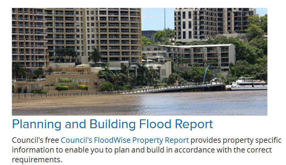
The direct link to the property report on the Council website.
Spatial relationships
By spatial relationships I mean topological relations like intersects, contains, touches and so on. There are probably a number of other geographic processes going on behind the scenes which are not made explicit but here I only discuss the relationships apparent to the user. For example, when a user searches for a property using a street address the returned property lot may be a conjunction of multiple lots at that street address. The relationship between street addresses, property lots and rate payers is not a trivial one.
Likelihood of flooding
The overlay relationship is used to relate properties to one of the four annual percentage chances of flooding categories. Different shades of blue are used to indicate the difference between the categories with the darkest colour being an area that floods more frequently and the lightiest colour being less so.
Source of flooding
Once again, the overlay is used to show whether the source of flooding is due to the swelling of the river, an overflowing creek, rising storm tide or overland flow. These choices of overlay however are discreet and the user can only view one at a time. It is unclear whether there is a relationship between the sources of flooding and the likelihood of flooding. By that I mean, is the likelihood an aggregation of all sources of flooding?
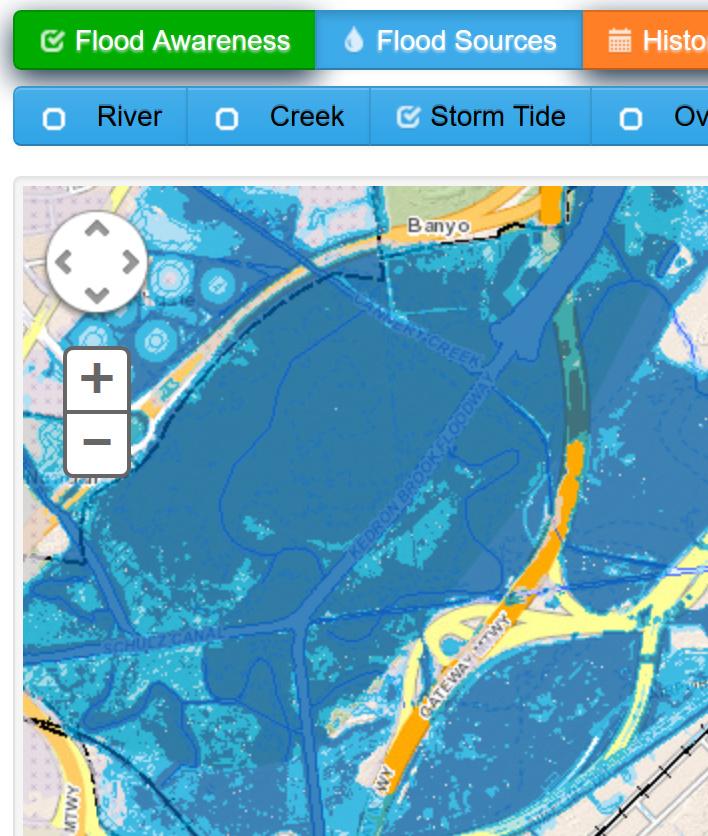
The map showing 'Storm Tides' as the flood source.
Temporal Relationships
The map depicts a couple of temporal relationships. The likelihood of flooding is temporal, in that it is predicting the future, and the past is visualised through the 1974 and 2011 flood events. Both the past and the future are related to a property through overlays.
Past floods
Two overlays are provided when the user selects ‘Historic Floods’. There are a couple of omissions worth noting for historical floods in Brisbane:
- No overlay is provided for the 1893 flood (Note: the layer looks to be in the wrong coordinate system).
- No aerial photography is utilised for the 2011 flood, even though it is available elsewhere.
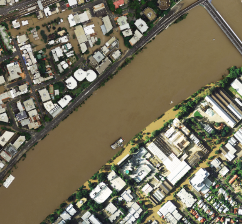
Brisbane river flooding in 2011 between Coronation Drive and Montague Road. Source: DNRM's Floodcheck app.
Discussion
The use of conventions around typical page layouts make for an experience that is easy to follow. In this design the map is more a figure or illustration that accompanies the text; albeit an interactive one. This choice of layout allows newcomers, especially users not well versed in interactive mapping experiences, to find a property of interest and understand the position the Council is prepared to state on the chance of flooding in anyone year.
However, there are number of choices left open to the user which add to the layout’s complexity. These choices are the buttons that allow the user to switch between likelihood, sources and past floods. These choices are unnecessary. An alternative layout would have been to give each mode its own page rather than cramming all the user interactions into the one page. By breaking the experience up into multiple pages that flow from selecting a property to the likelihood of flooding then to sources of flooding simplifies the design. Each page would only answer one question at a time. Maybe a breadcrumb at the top of the page would lend the pages a hierarchy of sorts, showing the pages stepped through. This detail guides the user down through the analysis and back up again, one piece of analysis at a time. Something like: 1 William Street Likelihood of Flooding Sources of Flooding. In fact, the overarching Brisbane City Council web site uses this paradigm for its other pages.
Layers are used extensive in the implementation. While there is nothing wrong with this approach an opportunity was missed by sticking with switching between overlays on a map. For example, a user must switch between the 1974 flood and the 2011 flood but cannot see both at the same time. Comparing these two floods is difficult. An alternative approach would be to rendered the two flood events side by side. Maybe the adoption of a small multiples layout would aid the user in comparing past floods without having to click between layers. One map showing the 74 flood, the other map showing the 2011 flood. Similarly, the page could dispense with the radio buttons for the sources of flooding all together and render four maps on the page all at once. The reader of the map could compare each map with ease by relying on the human eye to compare the difference between each map. Small multiples as an approach to map design is sorely under utilised in the GIS community, even though the technology supports it.
Then there is the callout box containing the link through to the property report. I think there is a strong case to be made to remove this altogether. Instead, place the link to the property report at the top of the page, directly below, or beside the section for searching for properties of interest. Also, once a successful property has been found, generate the report immediately and provide a link. The specialist user can then step through to the report as soon as it is available.
Finally, there’s the tantalising statement at the top of the page that says ‘the map does not show depth or speed of floodwater.’ This caveat removes the most critical dimension of flooding from the analysis. When I think of a flood the first image that comes to mind is the flood gauge at a river crossing that indicates the level of water flowing above the crossing. It’s a shame depths have not been thought through and visualised in some way. Maybe elevation profiles could be used to differentiate past flood events. Allow the user to draw a line and obtain an elevation profile which then marks on the y-axis the 1974 and 2011 floods. I understand relating depth to a property, which covers an area, makes elevation profiles difficult but advances in 3D visualisations in the browser provide a way to represent volumes of water over land.
Conclusion
The move away from the map as an application and the use of conventions around page layout have made the Flood Awareness Map a strong design. Interpreting a page, instead of only a map, establishes a linear flow that is easy to follow and the reader is more likely to enter the right information in the right place and decipher the text and illustration (map) as intended.
However, the designers of this map have not held their nerve. Instead, clunky user interface controls like the radio buttons have crept into the design unncessarily. I have suggested taking a small multiples approach to the design so as to keep the design more in line with a page inspired layout. This suggestion removes the sources of flooding radio buttons from the design without detracting from the geographical information imparted.
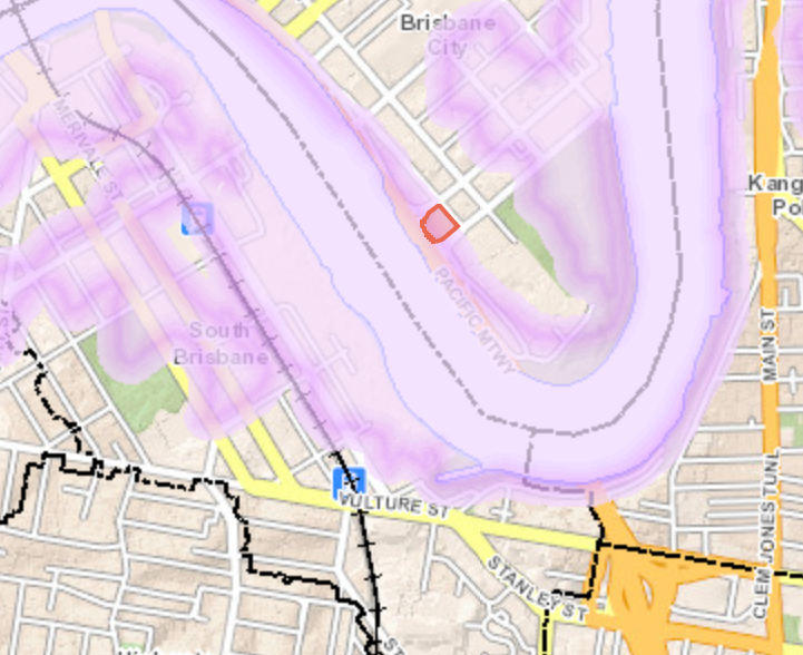
The blurred pink of the 1974 flood (Note the inability to zoom in).
At its core, the Flood Awareness Map is about the relationship between the neat boundaries of land parcels and the muddy boundlessness of flood water. The challenge of visualising flood water is most evident in the attempt to represent the courseness of the datasets used for the 1974 and 2011 floods. A hazzy light pink area denotes the 1974 flood with a blurred dark pink line marking its indistinct boundary. A paragraph is also shown, with the cautioning line: ‘historical lines are indicative only and have been deliberately blurred’. The map experience is underwelming. The user cannot change the extent. The ability to zoom in has been removed. All this to stop users misunderstanding the data. Visually, the only way out is to mark out the areas that are ambiguous precisely (computers do not do ambiguous well). But by doing this the map becomes more complicated as more layers must be added to depict the sections of the spatial data where the recording of the flood levels is course or non-existent. These ambiguous zones might change as the user zooms in and out as well. But more layers add more complexity, something this map has successfully managed to avoid by sticking with text. Instead, sentences are used to describe the ambiguity succintly.